A group of ten friends came together to launch a craft distillery and produce their own gin, and one of the founders happens to be a close friend of mine. That personal connection made the project especially meaningful, while also adding an extra layer of responsibility.
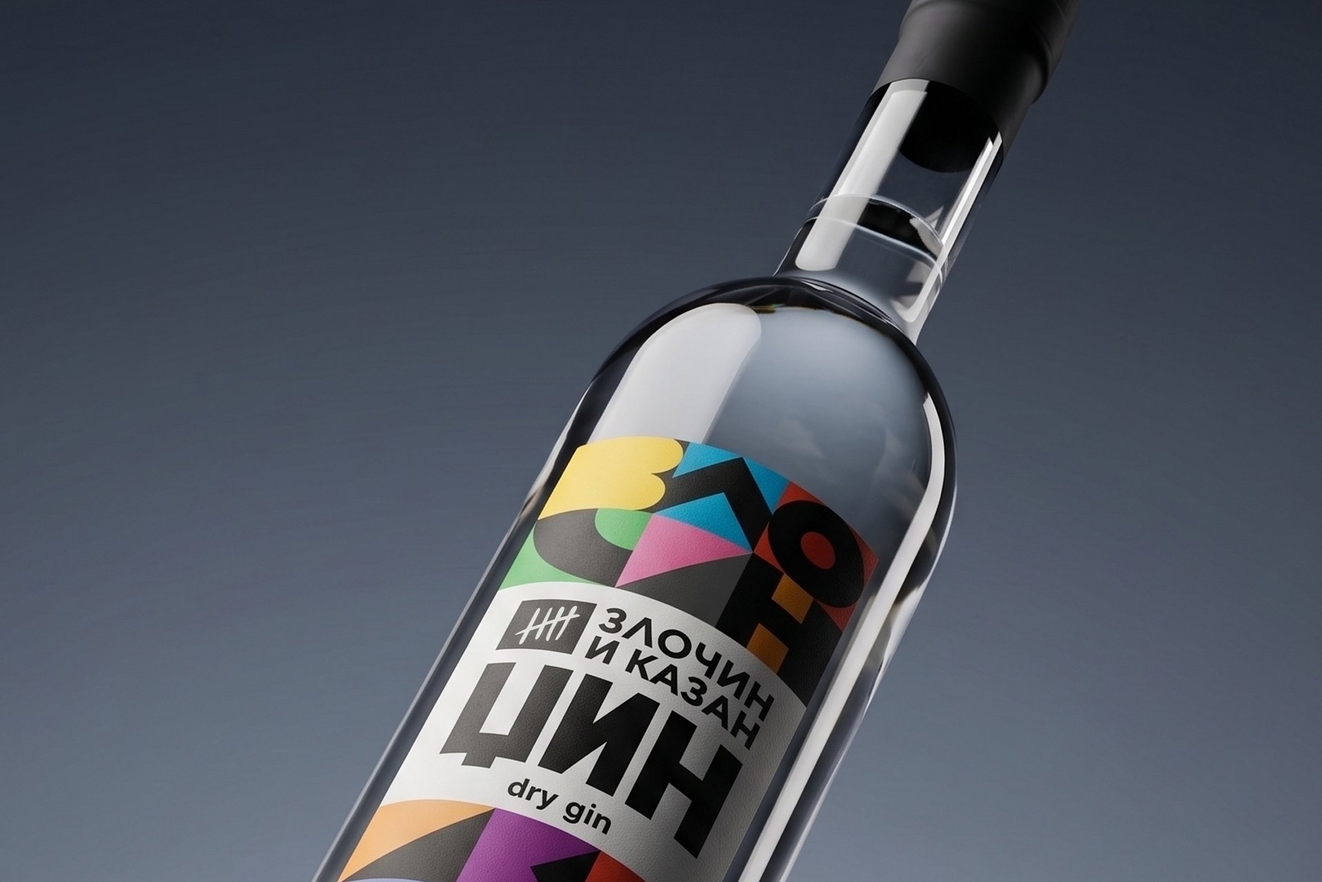
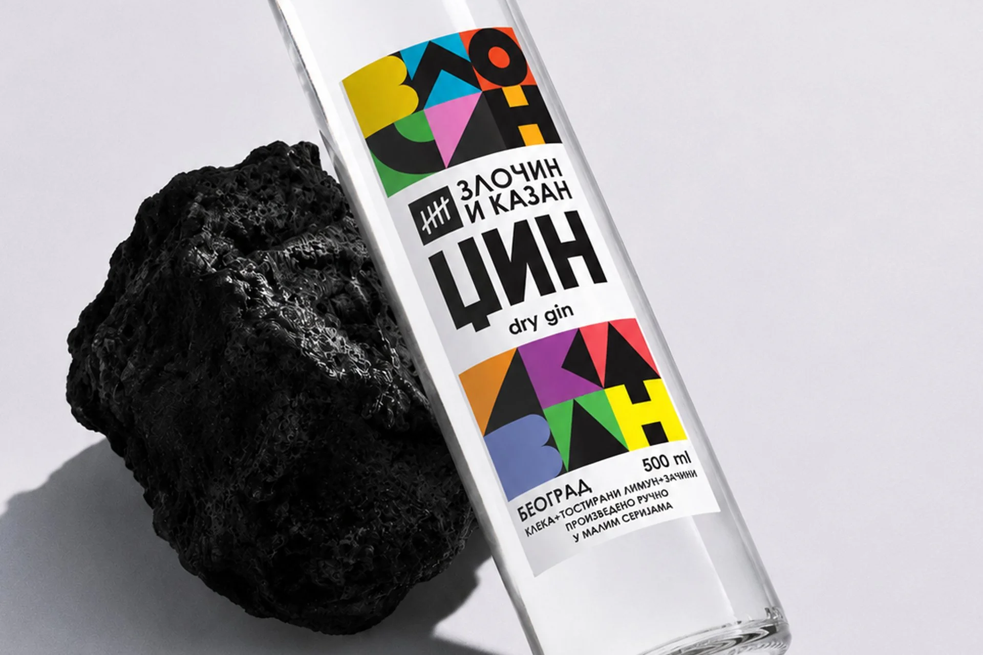
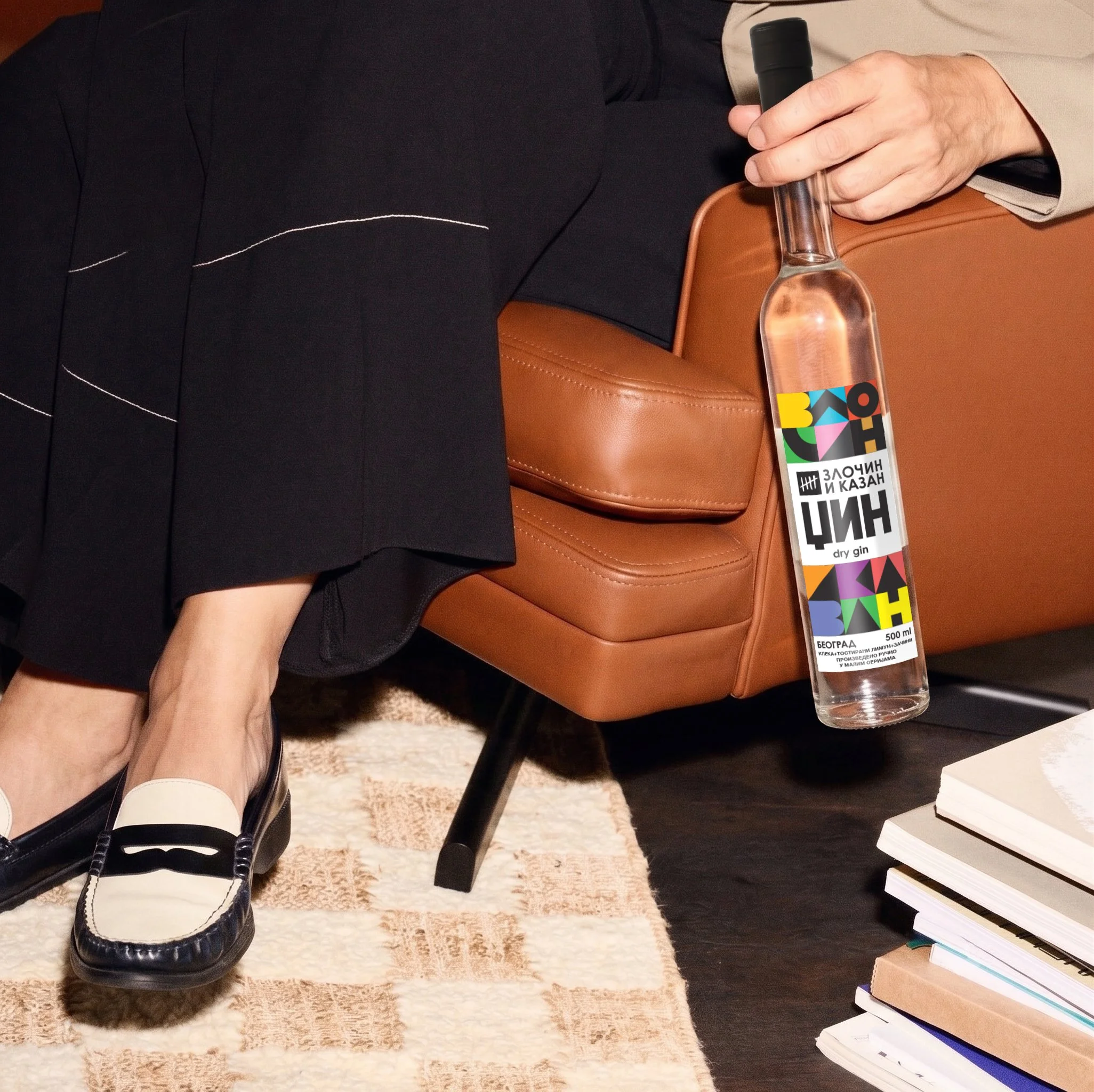
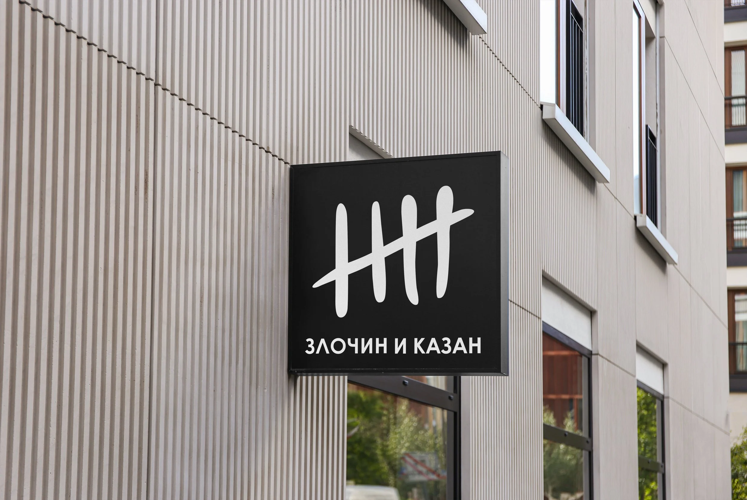
The brief was to create both the logo and the label for a bottle with a highly unconventional shape—something that stood apart from the typical silhouettes found in the gin category. The brand name is also the name of the distillery itself.
Zlocin i Kazan
Logo, graphics, label design
Role: Art/Creative Director
Year: 2022
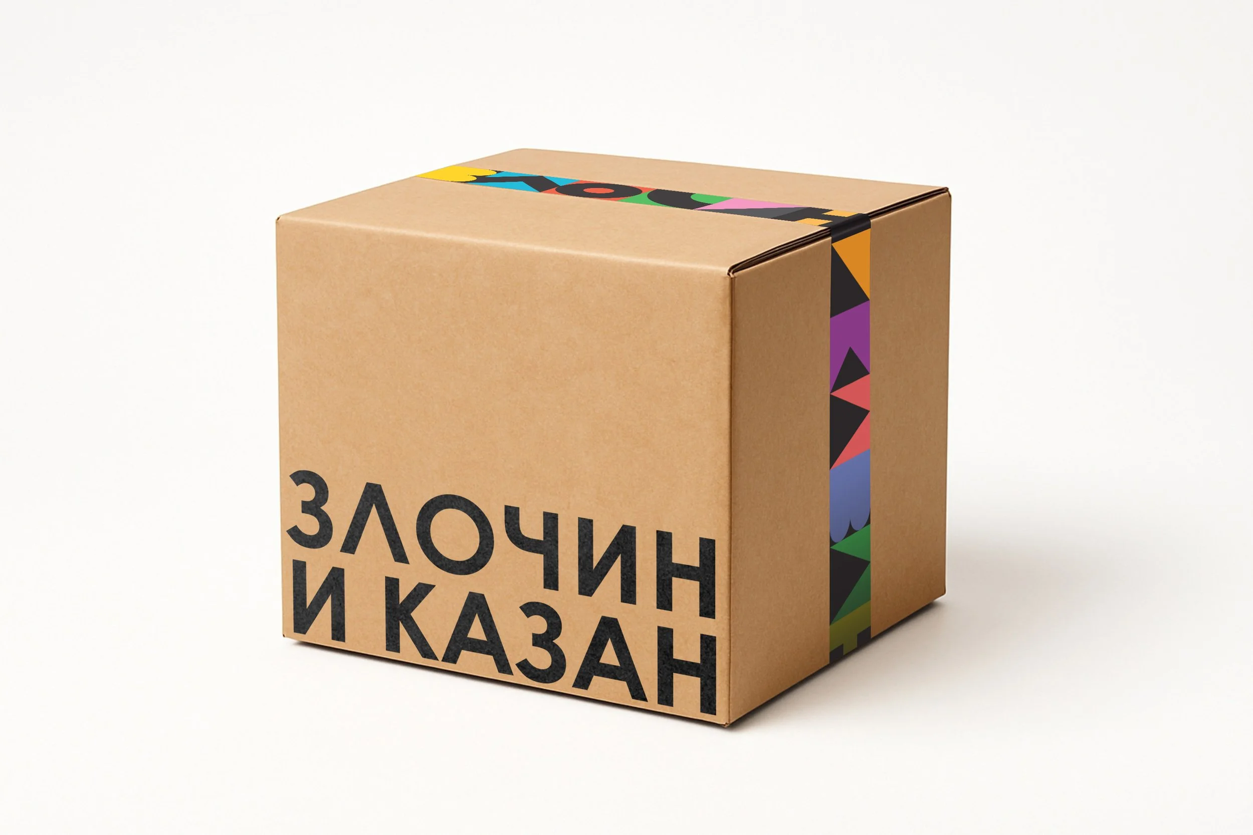

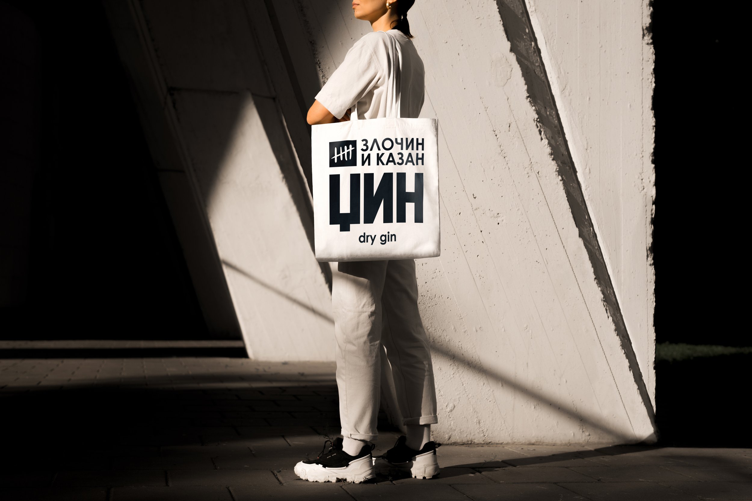
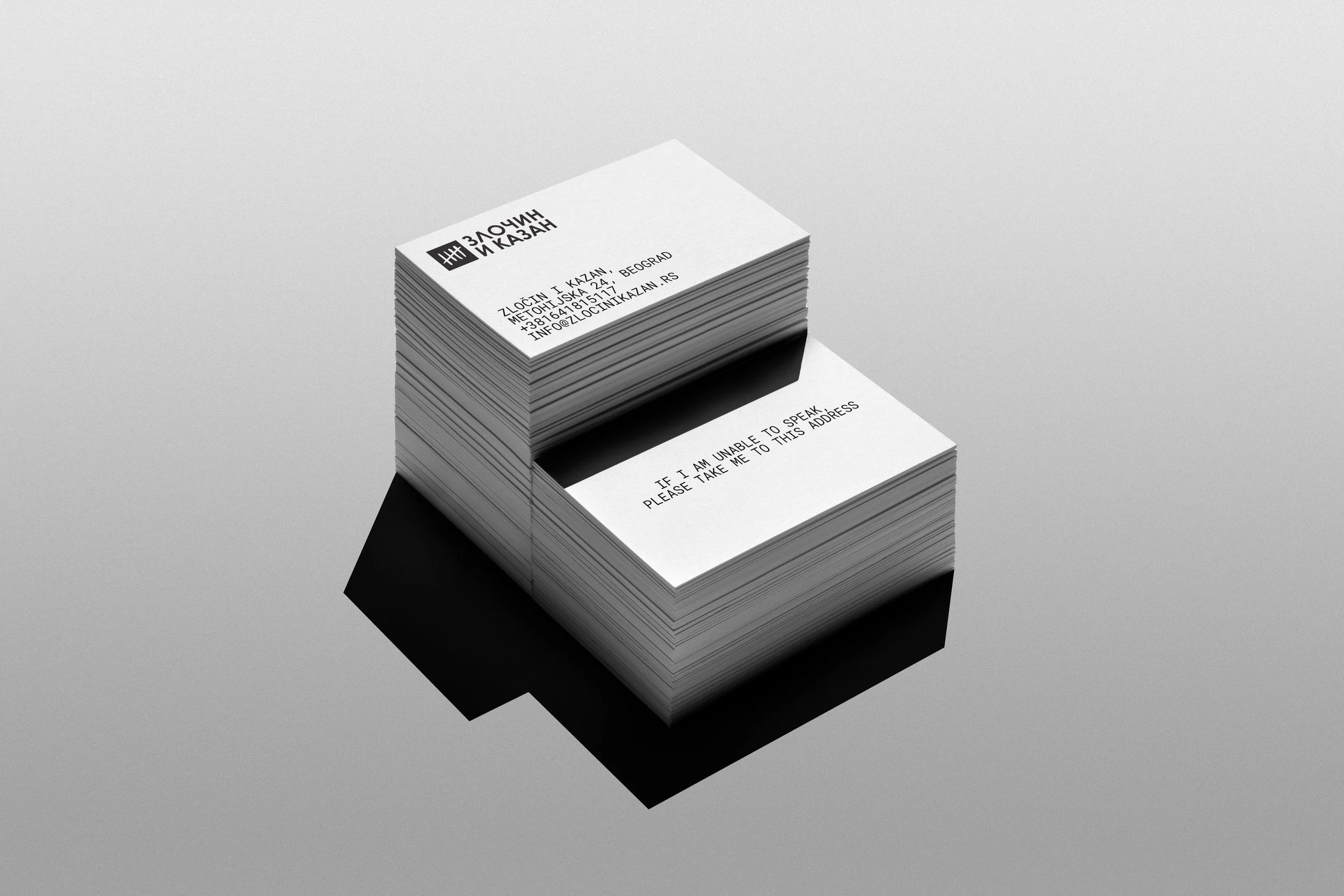
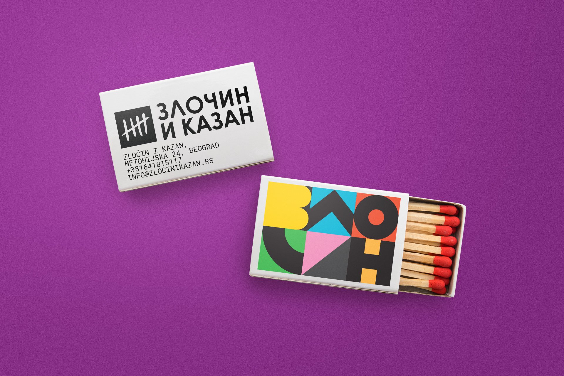
Zločin i Kazan is a playful Serbian pun on Fyodor Dostoevsky's famous novel
Crime and Punishment (Zločin i Kazna). By changing just a single letter, Kazna ("punishment") becomes Kazan ("still" or "distillation kettle"), transforming the literary reference into a name that perfectly reflects the spirit of the distillery.
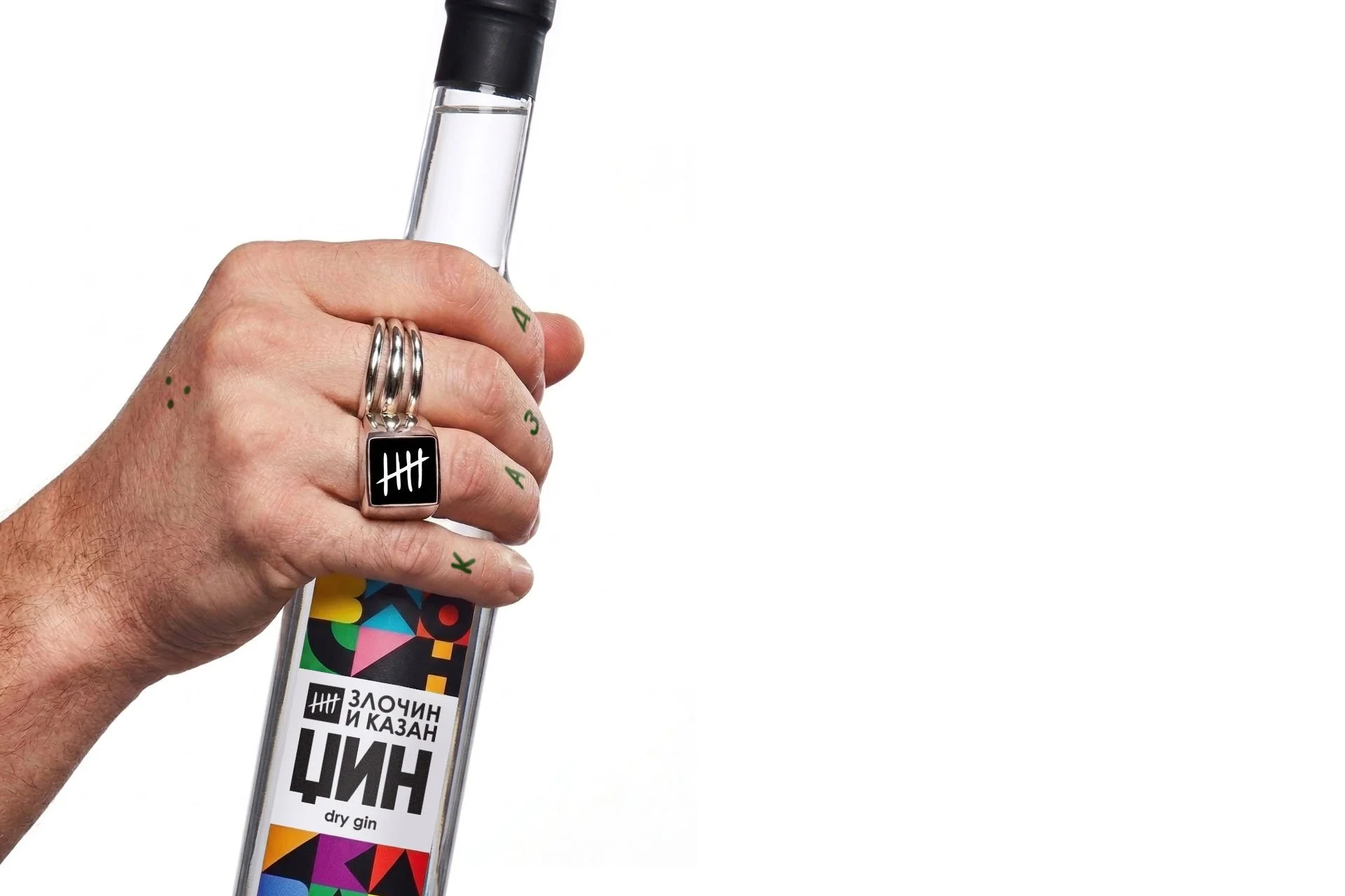
The visual identity is built around an abstraction of Cyrillic letterforms. By reducing their shapes into clean, minimalist patterns, I created a distinctive graphic language that defines most of the label. This approach allowed the packaging to feel both contemporary and deeply rooted in its local cultural context, giving the bottle a unique character that complements its unconventional form.